
A Comprehensive Guide to Dashboard Development for Your Business
Do you agree business intelligence makes intelligent business? Smart BI and analytics bring together tech and forecasts for better results. And the dashboard development became the best tool to adopt. We understand how businesses are tangled in piles of data. And this can overwhelming and confusing for them. So, developing a dashboard created an overview to achieve goals faster. Want to know more about it, let's dive in.
What is a business intelligence dashboard?
Dashboards are the interactive overview of disparate data sources. The business intelligence dashboard works as an analytical tool. It displays critical business data in a centralized format. You can add data visualizations to make it more interactive for the people. These dashboards allow the firms to track performance. The tech-driven approach to visualize data to form meaningful decisions. So, intelligent dashboard development consists of charts and reports. The BI dashboard tools are fixed but offer fluctuating metrics.
There are multiple organizations and internally they have multiple departments. Also, every department has to serve different purposes. So, the dashboard development tools can differ based on their needs and purpose. And the typical types of dashboards:
- Balanced Scorecard (BSC)
- Executive dashboard
- Analytical dashboard
- Operational dashboard
Key benefits of an intelligent dashboard development
Here are some advantages of using a BI dashboard for businesses.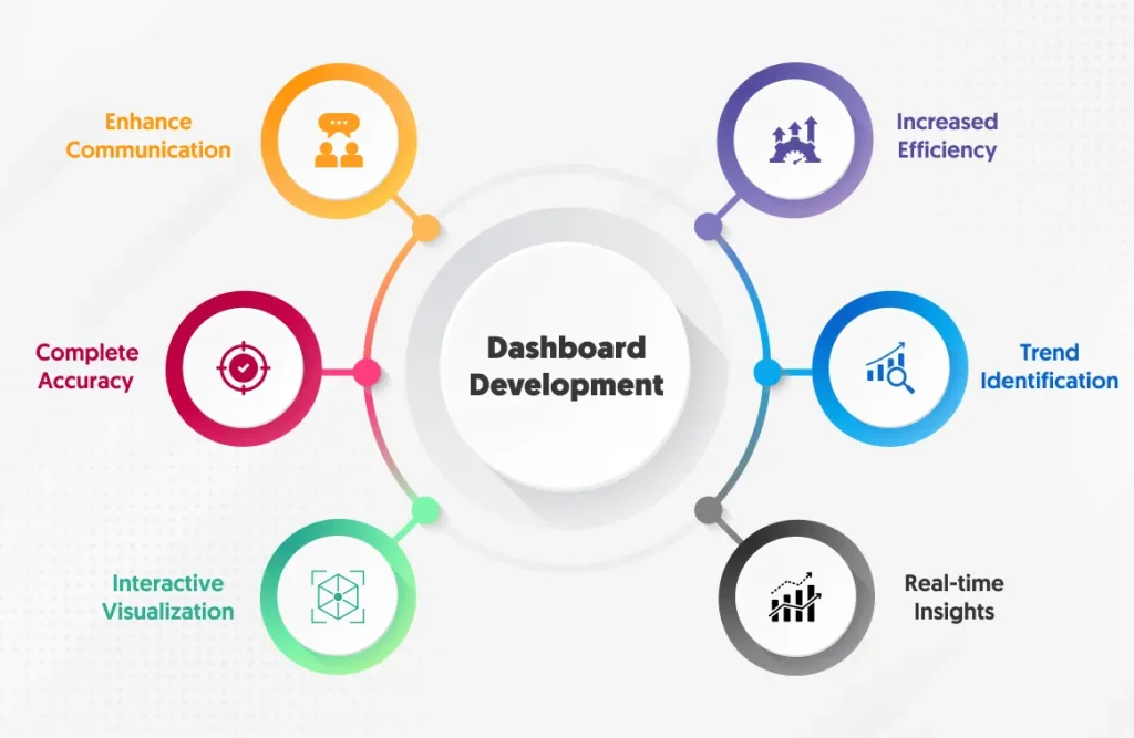
Enhance communication
The interactive features allow to presentation of static reports and emails. These analytics help to share the information with teams and executives. Or even your business partners get a complete hold of these reports. So, they remain informed and engaged around the business insights. As per reports, 75% of B2B and B2C companies said that dashboards are very important tools for their businesses. It makes the communication efficient to enhance collaboration.
Increased efficiency
If you looking for efficient results, how can you make such decisions without data? So, for the correct decision-making, you need a dashboard that takes data from users. And the dashboard development can help to achieve the best decisions. The enterprise can get relevant real-time insights and make informed decisions.
Complete accuracy
How your competitors are correct in business, sales, and marketing? Majorly, it has many accurate data to transform into decisions. And the real-time access to your data for instant decisions. And the sales dashboard software with a strategy can streamline firm operations. Once your employees get informed the guessswork comes to bay. Plus, it creates a balanced approach to achieving business goals.
Trend identification
Businesses across the sectors welcome new trends almost every day. And empowering the enterprise with the latest trends and other patterns. Easily analyze the positive emerging trends to help you get the best results. The correction of negative trends helps to improve organizational efficiency and optimization.
Interactive visualization
There are endless data sources that can offer crucial information for decisions. You get access to multiple data points for clear insights. The traditional spreadsheets have dispersed data across the business. So, the data varieties can help you produce visual content. Such as text, graphics, and more for presentation. It states that the clarity that dashboard development framework must have a visualization.
Real-time insights
Lastly, with real time you can produce quick results. And Power BI dashboard development offers accurate current information. There is no such database with the correct information. Instead, the disparate data sources have different data that together make the informed decision. Moreover, the few clicks help to present the best results to enterprises.
Related Blog - White label Dashboard
Factors to consider for a dashboard development
Here are some factors that consider successful dashboards.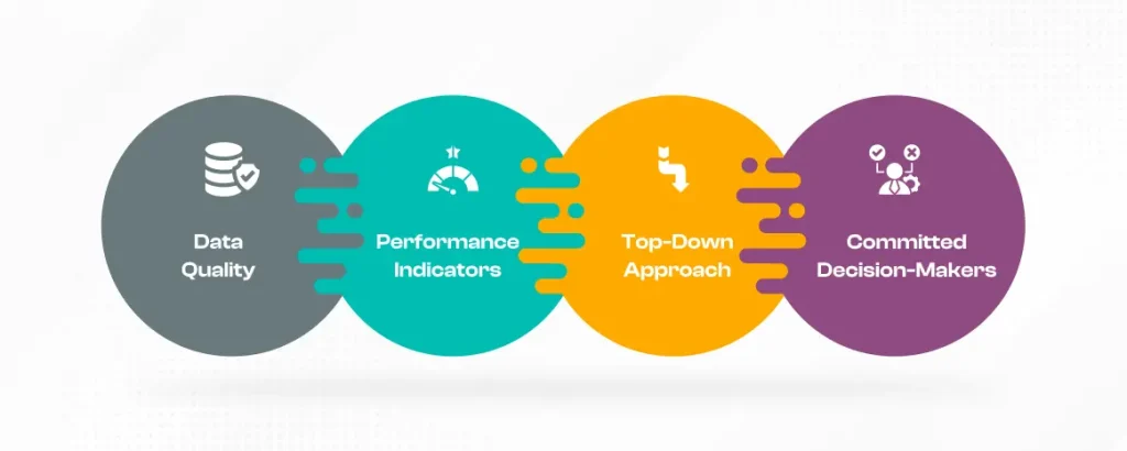
Data quality
Firstly, before you put any data into the dashboard check for the quality standards. Because it follows the simple rule of what you put is what you get. It's not a magic tool that offers the perfect decisions with delusional data. And the dashboard helps to meet your objectives to set the perfect implementation. So, the quality decisions offer ultimate performance depends on good data.
Performance indicators
To ensure the quality and availability of the data define the KPIs. Because if you want to establish these indicators you must keep the reason in mind. And keep the analysis of the dashboard at the topmost layer. The importance of KPIs in sales dashboard development is one of the complex steps for BI strategy. Even the software development metrics dashboard ranks the business objectives and monitoring of solutions.
Top-down approach
The KPIs as discussed earlier the one of the crucial points to be your priority. It shows how they keep the focus on the vision and specific indicators behind them. So, the top-down approach offers a clear canvas of the activity to align the strategic aspects. In-depth research about the business to go deep about data sources.
Committed decision-makers
The involvement of an executive during each stage of dashboard implementation is crucial. These leaders must ensure alignment between business strategy and dashboard development. Such as by validating business goals, KPIs, and the overall approach. Later, management can confirm that the dashboard effectively meets its objectives. As, it offers clear insights, and maintains an intuitive mobile-first dashboard design. Their oversight guarantees the dashboard's relevance, usability, and impact on decision-making.
Related Blog - Mobile first dashboard design
Best practices for intelligent dashboard development
Here are some tips to follow to develop a dashboard.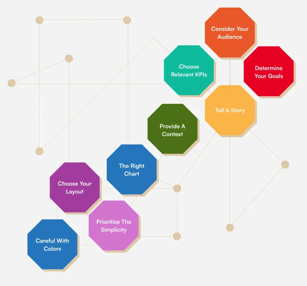
Consider your audience
Dashboard development is a lengthy process and checking your audience's needs. Know how you can integrate the user needs to create the analytics that serves them. The charts shouldn't be complex to confuse your users. Ensure the data analysis is clear and concise to convey accurate information. And for a successful dashboard view displayed in front of the audience. Don't go for fancy-looking dashboards because it doesn't need to add shimmer. Instead focus on the data should be accurate and efficient for the businesses.
Determine your goals
The dashboard UI design builds a strong relationship between the user and the dashboard development process. To set up the ultimate goals and focus on the specific data aspects. So, after understanding your users set your goals on how you will present the data overview. Schedule the interviews with clients andteams to get the report needs. To set up your dashboard, focus on selecting metrics. Even the data that directly aligns with your goals. Ask yourself key questions such as:
- What needs to be tracked?
- Who will be responsible for tracking it?
- What time intervals should be monitored?
Choose relevant KPIs
KPIs or key performance indicators are the metrics that show the business profits. It is one of the effective factors to integrate into your dashboards. After establishing your objectives for your audience, you can pinpoint the most relevant KPIs. These KPIs will guide the dashboard design, offering visual insights into key aspects. Storytelling plays a significant role here, as it enhances the presentation of your data. And you can achieve it with interactive KPIs. Or you can engage your audience effectively and present findings. This method fosters better understanding and drives overall success.
Tell a story
If you have looked we are walking steps to get an understanding of dashboard development. So, it's kind of telling a story to you. Even in dashboards we abide by the same rules. After establishing an effective workflow for dashboard design. It’s time to focus on crafting a data-driven narrative. Dashboard storytelling presents data visually to communicate business strategies. To ensure clarity it’s crucial to plan your dashboard layout. Start by choosing visual elements that align with both your goals and audience. This approach avoids randomly combining charts. And it ensures that each element serves a purpose. By considering user needs, you can create more insightful reports.
Provide a context
For effective data analysis in a dashboard, it's crucial to maintain proper context. Everyone involved should have a clear understanding of the data. Whether it's an employee, manager, or the executive itself. Without context, visual data and metrics may be misinterpreted. Dashboard development often raises questions, so it's important to offer comprehensive insights. Even for seemingly obvious details. Label axes include measurement units and title charts appropriately. Providing comparison values will help paint a complete picture, enhancing understanding.
The right chart.
Choosing the right type of graph or chart is crucial for conveying information. A poor choice can undermine your efforts, so it's important to match the visualization. There are four main categories for dashboard charts:
- relationship
- distribution
- composition
- comparison.
What if you choose pie to showcase the sales your business made two years to the present? It's a blunder. Understanding your goal will help you select the chart for clarity and impact. Since the brain processes visuals more easily than text. Try to create visualizations that resonate with your audience for actionable insights.
Choose your layout
Dashboard design is not just about selecting the right metrics and charts. It's also about ensuring an intuitive layout. When charts are placed thoughtfully, navigating the dashboard becomes effortless. A cluttered or poorly organized dashboard slows users down. And forces them to search for key data. The best practice is to position crucial information at the top. This placement aligns with natural reading patterns, as most cultures read from left to right. It makes data easier to find and understand at first glance.
Prioritize the simplicity
Whether for a large enterprise or an SMB, this layout principle ensures an intuitive experience. So, it makes the dashboard easier to navigate and understand. Designing a dashboard goes beyond selecting good metrics and charts. It's also about effective layout. Proper chart placement helps users find information quickly. A white-label dashboard can confuse users and slow them down. To avoid this, place critical data in the top left corner of the screen. We know simplicity is the key to achieving complex goals. As it aligns with natural reading patterns.
Careful with colors
Lastly, in dashboard development maintain a balance between personalization and clarity. When you select colors, it's important to remain consistent. Whether you choose to align with your company's branding or adopt a different palette. Limit your color scheme to two or three tones and gradients to avoid overwhelming users. Excessive use of intense colors can confuse rather than guide attention. Keeping a harmonious and subdued palette ensures that the dashboard remains easy. To navigate, use, and explain while also making critical data stand out when necessary.
Conclusion:
Developing a dashboard is a daunting task. But when you have the tips handy you can do it all at ease. As we mentioned some processes and factors you must know before starting dashboard development. Or you can consult a dashboard development company for more assistance.
FAQ
1. What are the challenges of dashboard design?Designers in this field prioritize simplicity and clarity when visualizing data. A dashboard must provide a vast amount of big data in a succinct and easily understandable way, minimizing excessive clutter and confusion. Interactivity is another important problem in dashboard creation.
2. What information should appear on a dashboard?A dashboard is typically designed to display disparate but linked information understandably. Stakeholders often require quick access to key performance indicators (KPIs) and other business measures.
3. What are the advantages of dashboards?Dashboards provide real-time data to monitor operations, manage processes, and improve corporate performance. They also aid in detecting and preventing potential difficulties.
4. How much does it cost to create a dashboard?A dashboard app typically costs around $37,500 to design. The overall cost ranges from $25,000 to $50,000. A dashboard app with a limited amount of functions will be less expensive than one that has all the desired functionality.
5. What is the most important aspect of a dashboard build?The first critical component of a successful BI dashboard is data visualization. Data visualization enables you to swiftly understand your company's performance and discover trends. Good data visualization may assist you in swiftly identifying problems and possibilities, as well as making educated decisions.