
Data Visualization Dashboard: All You Need to Know About It
In many of today’s large enterprises, companies rely on timely decisions based on piles of information gathered from big data sources. A data visualization dashboard defines itself as a piece of marketing dashboards software that translates big data into comprehensible, interactive graphics. These are not your conventional dashboards; these are presentations of robust data in the form of charts; they are narratives in the making. Any time the client wants to keep an eye on the critical success factors, improve marketing initiatives, or visualize sales, a good-looking dashboard improves engagement and delivers insights.
What is a dashboard, and what makes it stand out today?
Here are the key facets of dashboard design and seven inspiring examples that can amaze your clients.Why are data visualization dashboards so important?
But let me start with a clear explanation of why data visualization dashboards are just so important when it comes to managing a modern-day business.Simplify Complex Data
Dashboards provide structure to incredibly large amounts of data, making them easily understandable as well as appealing in terms of their presentation. The second strategic social media initiative is to drive informed decision-making. Thus, a properly constructed dashboard provides organizations the ability to make operational decisions based on the pattern and key performance indicators.Enhance Client Communication
By adopting an appealing dashboarding tool used for data presentation, firms can help avoid confusion by offering performance and growth results to the client.Promote Collaboration
The involvement of the team and client offers a single window through which the data was viewed, thus, increasing accountability. For purposes of project management, sales analysis, and a myriad of other applications, dashboards are a must-have in all industries and sectors.Key Features of a Great Data Visualization Dashboard
Data visualization dashboards are not a one-stop solution, a one-size-fits-all kind of instrument. What makes one stand out is the fact that it was designed this way or that. Let’s explore the characteristics of a successful dashboard in data visualization:
- User-Friendly Interface: Designed to improve usability, the interface of the dashboard does not require a technical person to operate it.
- Interactive Elements: Drilldown, filters, and hover effects help users get into details of the data.
- Real-Time Updates: For sectors such as sales and finance, in which value is placed on timely information, real-time updates are a requirement.
- Customizable Views: The client or any team member could perhaps have a preference, thus the reason for a customization of services.
- Modern Dashboard Design: It also makes for better reception, as the layout, including the color schemes and fonts used on a dashboard, is engaging.
- New line and bar charts where it is possible to compare monthly or yearly sales interactively.
- Regional sales trend maps clearly show the regions where they sell the products
- Performance against targets and KPI widgets.
- Integration with specific functions for analysis of individual results of a certain sales representative.
- Lead conversion rates illustrate with the help of funneling visualizations.
- The pairing of channels, for example, Google Ads with Facebook Ads.
- Time series plots of heatmaps that highlighted hours with high traffic.
- To run the program effectively, we are to incorporate it with tools like HubSpot and Google Analytics.
- Trends that provide estimates for potential future financial results.
- The analysis of planned and proposed budgets relative to the actual spending done by an organization.
- Measures of how long patients are waiting for care, occupancy levels reached by the bed, and the efficiency levels of the staff.
- Locating incidences of given diseases.
- A quintessence of creative filters of age, gender, or preference or location-based demographics.
- Responsive maps for using maps to understand movements of users.
- KPIs of the percentage of carts abandoned, average order value, and product trends.
- Machine learning of recommendation of the right optimization of inventory.
- Separate activities measure the number of minutes and hours.
- KPI for rate of completion of tasks and time targets.
- Line graphs indicate performance as a resultant of self-working as compared to peers/team members to work.
- Project time frames use charts.
- Performance indicators of the resources for distributing responsibilities within the work environment.
- Automating of risk analysis and graphical representations that could be used in case of likely delay.
- Avoid clutter by focusing on essential data points.
- Use white space effectively to separate different sections.
- Use simple graphics; do not cram visuals with them, and do not use 3D charts if there are no reasons to do so.
- Mark proper labels and include tooltips and/or legends so that the charts can be read with a minimal number of instructions.
- The color hue should come as a direct reflection of what the client requires.
- Different font styles and sizes should not be applied close to each other.
- Standard chart types should be used for recognition’s sake, except a custom chart conveys a precise meaning that a normal chart does not.
- Use all the latest trends in dashboard design to get a professional-looking dashboard.
- Make sure the current state of the data visualization dashboard is responsive (desktop, tablet, & mobile).
- See how some visuals behave when scaled up or down.
- Employ techniques of responsive design in order to improve the accessibility of the page in small sizes.
- Make options that will enable users to perform research based on their own preferences, such as filters and/or drop-down lists.
- The imposition of further values to the options allows for the option of drill-down.
- Retain supplementary content off to the side by employing hover effects in order to avoid cluttering the screen.
- If it is a finance industry or sales industry, ensure that the data on the dashboard is updated as it happens.
- Wherever possible, you should use APIs or integration in real-time databases to get fresh data.
- It helps the client to know what is required regarding the goals of the client’s business and create the ideal dashboard.
- Measure only those aspects that are of importance to the user—do not load the user with information he or she does not care about.
- Engage stakeholders during the designing stage to obtain their recommendations.
- In addition, it is necessary to perform a user test to discover some possible pain points.
- Test the load speeds for particularly large data sets, where possible, specifically for the dashboard type of application.
- Confirm information reliability to conscientize users.
- External cooperation with a dashboard-creating company for more elaborate features or unique looks.
- Expert developers are capable of adding such values and features as artificial intelligence and predictive analysis.
- Relevant Metrics: Always operating with key performance indicators that are relevant to the business goals.
- Interactive Features: Data view filters and sub-groups, as well as features allowing users to zoom in on specific data entry.
- Clear Visual Hierarchy: Tidy structure with clear and uncluttered charts and graphs.
- Real-Time Data Updates: Secures that all decisions are taken based on current information.
- Experience: Search for portfolios of types of data visualization dashboard designs for fields of business, for instance, healthcare, finance, or marketing business.
- Technology Stack: Make sure they use better tools like Power BI, Tableau, or even an Analytical Tool developed by your firm.
- Portfolio: Check how they have designed the dashboards they implemented previously in data visualization projects to evaluate their quality.
Types of 7 Data Visualization Dashboards
Here are seven examples of exceptional dashboards to meet specific client needs: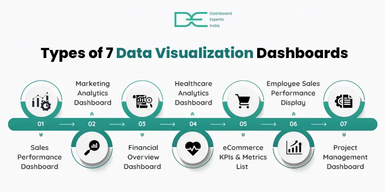
1. Sales Performance Dashboard (Power BI Sales Dashboard)
It should be noted that this particular dashboard was created with the focus on the sales aspect of the business.Purpose:
Offers live data on sales such as revenues, revenue increase rate, and geographic distribution for business firms.Key Features:
2. Marketing Analytics Dashboard
For clients interested specifically in digital marketing, this template shows how a campaign was performed and where it could be improved.Purpose:
Is used in capturing advertising return on investment, social media effectiveness, and lead generation statistics.Key Features:
3. Financial Overview Dashboard
This dashboard is essential for any company that has an interest in a detailed financial analysis of its operations.Purpose:
Provides net and gross dividends on investments and a brief cash flow, gross and net income, and profit margin analysis.Key Features:
4. Healthcare Analytics Dashboard
There is no doubt that modern healthcare organizations require accurate information to improve patient care, and this dashboard does just that.Purpose:
Supervises issues of hospital efficiency, assets, and patient data.Key Features:
5. eCommerce KPIs & Metrics List
Being applicable for online selling most intensively, this dashboard encompasses all the significant aspects of a client’s path to the purchase.Purpose:
Real-time control of website traffic, sales, and customer conduct.Key Features:
6. Employee Sales Performance Display
This page aims to assist clients in tracking and optimizing workforce productivity.Purpose:
Provides dynamic visibility into the data into the employee and team performance levels.Key Features:
7. Project Management Dashboard
It is an essential application to use when it comes to tracking the schedules and deadlines of a project.Purpose:
Identifies some of the most important goals and delivers information regarding the project's progress, targets, and scheduled time.Key Features:
How to Choose the Right Dashboard for Your Clients?
Selecting the perfect dashboard for data visualization depends on the following factors:Understand the Industry Needs
Some clients, such as in healthcare, may require a place to keep patient information. As a result, a retail client may require storing information on sales and stock.Define data requirements
The next step is to determine the kind of data to use for analysis and presentation—either financial, operational, or marketing data.Consider Customization
Make sure you have it in a format that you know your client would love, as well as the design of the company.Use the Right Tools
Data visualization dashboard is now easier and more effective with Tableau, Power BI, and Google Data Studio. Related Blog - Modern dashboard designBest Practices for Creating Stunning Dashboards
Prioritize Clarity Over Complexity
Use Consistent Themes
Optimize for Responsiveness
Enable Interactivity
Incorporate Real-Time Updates
Align with User Needs
Test Usability Thoroughly
Collaborate with Experts
FAQs
1. What is a data visualization dashboard, and why is it important for businesses?
A data visualization dashboard is an online utility that shows necessary data points in the form of an easy-to-navigate chart. It takes data inputs in simple formats and converts them into figures, graphs, charts, and other related items to help businesses notice trends and other measures, including KPIs.
2. What are the key components of a well-designed data visualization dashboard?
A well-designed dashboard for data visualization includes the following components:
3. How do I choose the right dashboard development company for my business?
Choosing the right dashboard development company involves evaluating: