
Guide to Choose the Best Power BI Dashboard Design for Your Business
Dashboards remain a potent tool for any business growth. Modern businesses struggle to gather crucial data and form one solution. So the Power BI dashboard design works as your go-to choice to decide. Whether, it's sales, enterprise, executive, or trading, you can get it all in the dashboard. So, before you get overwhelmed with the options, let's dive in for a clear understanding.
An overview of Power BI
Power Business Intelligence or Power BI serves as an intuitive data visualization tool tailored to diverse needs. It empowers professionals with dashboards and visual tools that simplify interpreting information. Users can view data through dynamic formats like charts, graphs, maps, and scatter plots. Additionally, its AI-enhanced insights intelligently uncover trends and patterns.
The Power BI dashboard design includes various applications. Such as Power BI design Desktop, Pro, Premium, Mobile, Embedded, and Report Server. While some versions are free, the Pro and Premium subscriptions unlock advanced analytics. Power BI is also a low-code tool within Microsoft’s Power Platform encompasses Power Apps. This suite empowers users to visualize data, create business solutions, and automate workflows.
Power BI Report Server provides a secure, on-premises reporting solution. And it ensures protected report management. With Power BI Mobile, professionals access these reports on the go. It makes it easy to make well-informed decisions swiftly, from virtually any location.
Applications of Power BI
Microsoft Power BI offers a platform for analyzing organizational data for valuable insights. It enables users to integrate different data sources, transform data, and intuitive visualizations. Businesses keep Power BI dashboard design to analyze their overall analytics. With Power BI, firms can leverage these models in multiple ways. Such as:
- Using data visualizations to communicate insights effectively.
- Exploring 'what-if' scenarios to assess potential business outcomes.
- Producing real-time reports that aid in making predictions.
- It offers customizable dashboards for executives, allowing managers to gain deeper insights.
Crucial features of Power BI for business
Here are some important components of BI for business.

AI capabilities
Power BI allows users to build machine learning models to perform text and image analysis. And it integrates with Azure Machine Learning for more advanced functionalities. Get a dashboard development company for more assistance. So, the smart integration of AI can help to improve the dashboard integration.
Hybrid deployment
Built-in connectors allow the Power BI dashboard design to connect with various data sources. It involves Microsoft tools, Salesforce, and other providers. So, it offers incredible support to grow your business across the hybrid platforms.
Model support
The platform offers standardized data structures accessible across the organization. It makes data management more uniform and efficient. And it offers incredible support to customize the dashboard as per your business needs.
Cortana integration
Mobile device users can interact with data through natural language queries. It uses Cortana Microsoft’s digital assistant, to quickly retrieve insights. It presents an integration with the Cortana for quick interaction.
API integration
Power BI dashboard design provides APIs and sample code, enabling developers to integrate dashboards. It offers interaction via software solutions to the business and the users.
Value of Power BI dashboard design for businesses
Here are some crucial dashboard design values offered to various firms.
Streamlining data analysis
Power BI dashboard development integrates data from multiple sources. It presents it in a visually engaging format that allows for immediate analysis. Decision-makers gain a clearer view of performance metrics and customer insights. The visual reports support quicker evaluations and strategic adjustments.
Enables informed decisions
With relevant information available, the Power BI dashboard design empowers teams to make accurate decisions. They are beneficial for monitoring KPIs to recognize trends and evaluate business strategies.
Enhances operational efficiency
Automated reporting and data analysis reduce the time spent on manual processes. It minimizes errors and improves operational productivity. Power BI enables businesses to monitor operations and optimize resource usage.
Supports seamless collaboration
Power BI fosters a data-driven culture by allowing stakeholders to access, share, and analyze data. Team members can annotate visualizations, perform analyses, and align efforts for growth.
Offers scalable solutions
Power BI dashboard design can scale to accommodate additional data sources. And equipped to support growing data needs the businesses remain agile and responsive. Partnering with Power BI consultants can enhance implementation and maximize the potential. It ensures long-term scalability and flexibility.
Top Power BI dashboard design examples to choose
Let's look at the different Power BI dashboard design ideas.
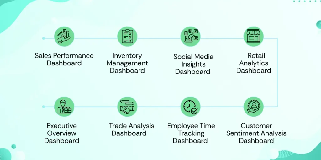
Sales Performance Dashboard
The Power BI sales dashboard provides a comprehensive view of sales dynamics. And the performance metrics to assess the company's current growth rate. With essential KPIs, it visualizes primary and secondary sales. You can categorize by period, product, brand, state, dealer, and partner, and charts. This dashboard creation enables leaders to make year-over-year comparisons. It helps to evaluate performance trends over time. Filters allow teams to drill down by year, type, or dealer with tailored analysis.
The inclusion of this level of insight allows sales teams to identify high-performing segments. And underperforming areas, making it easier to realign strategies as needed. Managers monitor their team’s overall performance with real-time sales data. So, that you can drive decision-making and support data-backed strategies.
Inventory Management Dashboard
Power BI dashboard design works across various industries such as retail, FMCG, and hospitality. It is invaluable for managing stock levels with accuracy and transparency. With a visually appealing interface, it offers real-time insights into stocks and demands. Detailed data segmentation allows businesses to analyze inventory. By category, location, season, or gender for effective forecasting. And improved responsiveness to fluctuating customer demands. It showcases top-performing products and enhances operational dashboard services efficiency.
This tool helps businesses anticipate the need for inventory replenishment based on demand cycles. And it provides visibility into stock turnover rates and inventory valuation. Ultimately, this inventory solution equips managers with the ability to reduce holding costs. Moreover, it improves supply chain efficiency and supports customer satisfaction. And through timely stock availability and fulfillment, helping businesses stay competitive.
Social Media Insights Dashboard
In the fast-paced digital landscape social media dashboards offer businesses an advantage. By offering a complete view of their online presence. It tracks KPIs across multiple social media channels, sentiment, and influencer impact. Through in-depth analysis, this tool enables brands to understand audience preferences. It measures campaign performance and tracks shifts in online sentiment. By providing a solid foundation for data-driven marketing strategies. With visualizing mentions, reach businesses can optimize marketing strategies.
Marketers can also adjust tactics on the fly based on real-time insights. It fosters more personalized connections with followers. It improves brand awareness among the new users. This dashboard enables seamless tracking of social media campaigns. It helps brands enhance their online reputation and gain a competitive edge. And it ensures their messaging remains relevant and effective.
Retail Analytics Dashboard
This Power BI dashboard design is a powerful tool for achieving data-driven growth. And it offers a 360-degree view of critical metrics. It includes pages dedicated to sales, profits, orders, and shipping details. And presents an all-inclusive look at retail operations. With intuitive visualizations, it helps managers track gross sales, profits, and best-selling products. It allows for actionable insights into every facet of retail performance. One of its standout features is the ability to show top-performing product categories. And analyze trends in customer demand.
This dashboard allows retailers for the most profitable items and pinpoint the highest-demand regions. And optimize inventory as per the sales and performance of the business. Additionally, it includes the Power BI interactive dashboard's row-level security, ensuring sensitive data is accessible. It is only to relevant personnel based on their role. Retailers can use this dashboard to align their operational efforts and manage inventory efficiently. They craft data-informed strategies to enhance customer satisfaction to drive growth.
Executive Overview Dashboard
For executives, the dashboard Power BI provides a crucial, high-level view of firm performance. And that too across various departments. By integrating essential KPIs it offers insights. Such as revenue, profit, employee productivity, and customer orders. It gives leaders a quick but thorough overview. This dashboard allows executives to monitor monthly progress in critical business areas. And it enables them to act promptly on underperforming sectors. With a focus on organizational growth and it also includes data on gross profit margins.
The Power BI dashboard design offers an intuitive interface by ranking top employees. By supporting long-term strategic decisions the dashboard ensures alignment of executive dashboard services. The inclusion of predictive insights helps executives identify growth opportunities. It reduces risks and strategically plans future roadmaps making it the best tool for informed decisions.
Trade Analysis Dashboard
The trade analysis dashboard in Power BI converts extensive trade data into meaningful insights. It offers an organized view of trading trends across the top ten European markets by GDP. Yearly trade volume, top traded goods, and transport modes offer a detailed picture of trade activity. The Power BI dashboard design can see which categories are most profitable and identify cargo types. By volume, and understand the transport methods most used for specific goods. Filters for country, category, and transport type enhance the analysis. As it allows for tailored insights into each country’s trade strengths. For export-import specialists, this tool highlights cost dynamics.
It makes it easier to optimize resource allocation and enhance efficiency in international operations. With clear data visualization decision-makers can easily track market fluctuations. It enables companies to maintain competition in the global market. And make well-informed, strategic decisions in trade management.
Employee Time Tracking Dashboard
This Power BI dashboard design offers firms a complete view of employees. As, to know the productivity by monitoring time spent on applications, tasks, and projects. Managers can use it to evaluate productive and unproductive intervals during specific periods. The dashboard also shows the top five applications by productive time. Along with an hourly breakdown, helping managers identify workflow patterns. So, that they can improve task allocation.
Additionally, it provides insights into employees’ arrival, break times, and overall productivity. You get color-coded visuals for quick assessments. Monthly comparisons give management a deeper understanding of employee efficiency. And over time it enables teams to make more informed decisions. That too regarding resource allocation and project timelines. This tool enhances workforce management, fosters accountability, and improves organizational productivity. Moreover, it helps to identify bottlenecks and support better planning.
Customer Sentiment Analysis Dashboard
Understanding customer sentiment is essential for managing brand reputation effectively. This Power BI dashboard provides insights into customer attitudes across social media. Tracking positive, neutral, and negative feedback and revealing customer perception. The tool categorizes mentions by sentiment type, helping identify experience gaps. Teams gain real-time data on brand reputation and product perception trends.
Marketing teams leverage these insights to address negative feedback immediately. The tool strengthens customer relationships by fostering informed, data-driven responses. It presents sentiment trends visually, aiding managers in monitoring public opinion shifts. With clear insights, brand teams can align customer engagement strategies effectively. This approach supports a positive brand image and nurtures customer loyalty naturally.
Conclusion:
Dashboard designs are carefully optimized to get data and analytics together. To get an accurate Power BI dashboard design you must follow the step-by-step process mentioned above. Or you can consult a dashboard development company for more assistance.
FAQs
1. What is the objective of the Power BI Dashboard?
A Power BI dashboard is a single page, often known as a canvas, that employs visuals to tell a story. Because it is confined to one page, a well-designed dashboard only includes the most relevant aspects of the tale.
2. How are dashboards built in Power BI?
Dashboards can be made up of pinned visuals pulled from various reports. A Power BI dashboard can include visualizations from many semantic models, whereas a Power BI report only uses data from one semantic model.
3. What are the major advantages of adopting BI dashboards?
A BI dashboard delivers information about the health of a firm. Businesses can focus and optimize their operations by identifying trends in their data. They can then attempt to either continue improving their results or to protect problems from worsening so that they can subsequently improve the outcomes.
4. What is the concept of a dashboard in Power BI?
A BI dashboard is a business intelligence application that allows users to monitor, analyze, and report on important performance indicators and metrics. BI dashboards generally display data in charts, graphs, and maps, allowing stakeholders to comprehend, share, and collaborate on the information.
5. How much does it cost to create a dashboard?
A dashboard app typically costs around $37,500 to design. However, the total cost could range from $25,000 to $50,000. A dashboard app with a limited amount of functions (also known as a minimum viable product, or MVP) will be less expensive than one with the desired functionality.